Why the automated checks failed on the home page, 17 November 2026
This report is for Simon D'Arcy. It explains every check that failed when the new automated checks from the website rebuild pack were run on the home page of projecthouston.ai for the first time. Nothing on the website was changed to make this report. No check was changed. The report gives two options for each group of failures. It does not recommend one.
Where the numbers come from. The checks ran on Tuesday 17 November 2026, starting at about 3:44 pm Melbourne time, on a Cursor cloud computer. They tested a copy of the website running on that computer at the address http://localhost:48213. That copy is built from the same files as projecthouston.ai and runs through the same Cloudflare program, which is called the Worker. The command was npm --prefix tests run check. Every number in this report was counted from the saved results of that run, unless the report says otherwise.
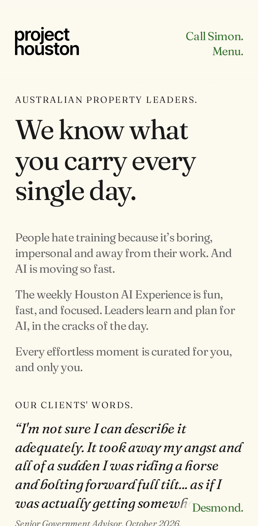
Where the pictures come from. Every picture is a real screenshot of the same local copy of the home page, taken on 17 November 2026 with Playwright, the program the checks use to drive the browsers. Where something was drawn on top of a picture, the picture says "added highlighting" or "added label". Where a picture shows something the website does not do today, the picture and its caption say "mock-up". Mock-ups were made by adding a style in a separate browser session used only for that screenshot. The website files were not edited.
Words used in this report
A check is one test, run on one screen size, in one browser. The same test run on 55 screen sizes counts as 55 checks.
A browser engine is the part of a web browser that draws the page. The checks use three. Chrome (Chromium) is the engine inside Chrome, Edge and Samsung Internet. Safari (WebKit) is the engine inside Safari and every browser on an iPhone. Firefox is the engine inside Firefox.
A pixel is the unit of length used for screens. A phone screen is usually between 320 and 440 pixels wide. A laptop screen is usually between 1280 and 1920 pixels wide.
The security setting in this report means the Content Security Policy. It is a list that the website sends with every page. The list tells the browser which styles and which scripts it may use. Any style that is not on the list is refused. The Worker sends this list on projecthouston.ai and on the local copy.
JavaScript is the programming language that runs inside the page. On the home page it makes the Listen buttons, the films, the email box and Desmond work. A visitor can switch it off in the browser settings.
The whole picture
The browser tests ran 825 checks. 359 passed. 339 failed. 127 were skipped. 359 + 339 + 127 = 825. A skipped check is one that the test itself only runs in some places. For example, the forced colours check only runs in Chrome (Chromium), and the touch screen check only runs at touch screen sizes. No check was skipped by hand.
The 339 failed checks fall into seven groups. Each failed check is in exactly one group.
| Group | Chrome (Chromium) | Safari (WebKit) | Firefox | Total |
|---|---|---|---|---|
| Text size and text spacing checks that could not start | 52 | 50 | 8 | 110 |
| The keyboard focus mark is an underline, not an outline | 26 | 25 | 4 | 55 |
| No approved pictures exist yet, because this was the first run | 26 | 25 | 4 | 55 |
| The page has four Heading 1s, and the check expects one | 26 | 25 | 0 | 51 |
| Buttons shorter than 44 pixels on touch screens | 18 | 20 | 0 | 38 |
| The forced colours check could not start | 26 | 0 | 0 | 26 |
| Firefox with JavaScript switched off stopped at the time limit | 0 | 0 | 4 | 4 |
| All groups added together | 174 | 145 | 20 | 339 |
Sum check. 110 + 55 + 55 + 51 + 38 + 26 + 4 = 339. Across the three browsers: 174 + 145 + 20 = 339. Both totals equal the 339 failed checks in the results file.
The checks test 26 screen sizes in Chrome (Chromium), 25 in Safari (WebKit) and 4 in Firefox. That is 55 screen sizes in all. A group that failed at every size in every browser has 55 checks.
Separately from the 339 browser checks, three other steps of the same run also failed. They are explained at the end: the 404 style-file problems, the 173 page-structure errors, and the Google search score of 69 out of 100.
Group 1. Text size and text spacing checks that could not start: 110 checks
Chrome (Chromium): 52, Safari (WebKit): 50, Firefox: 8. Total: 110. This group holds two tests. The double-size text test failed 55 times. The text spacing test failed 55 times. 55 + 55 = 110.
What the check tests
The double-size test makes the base text size of the page twice as large, then checks two things. The page must not scroll sideways, and no box on the page may cut off its text. The text spacing test does the same after adding more space between lines, letters, words and paragraphs. These are two of the international accessibility rules, called WCAG 2.2, rules 1.4.4 and 1.4.12.
What failed
Neither test could start. To change the text size or the spacing, each test adds its own style to the page. The website's security setting refuses any style that is not on its list, so the browser refused the test's style. All 110 checks stopped at that first step, with the message that the style "violates the following Content Security Policy directive". The tests never measured the page.
What it means for a visitor
This run says nothing about how the page behaves for a visitor who enlarges text, because the measurement never happened. The security setting does not block a visitor's own browser zoom.
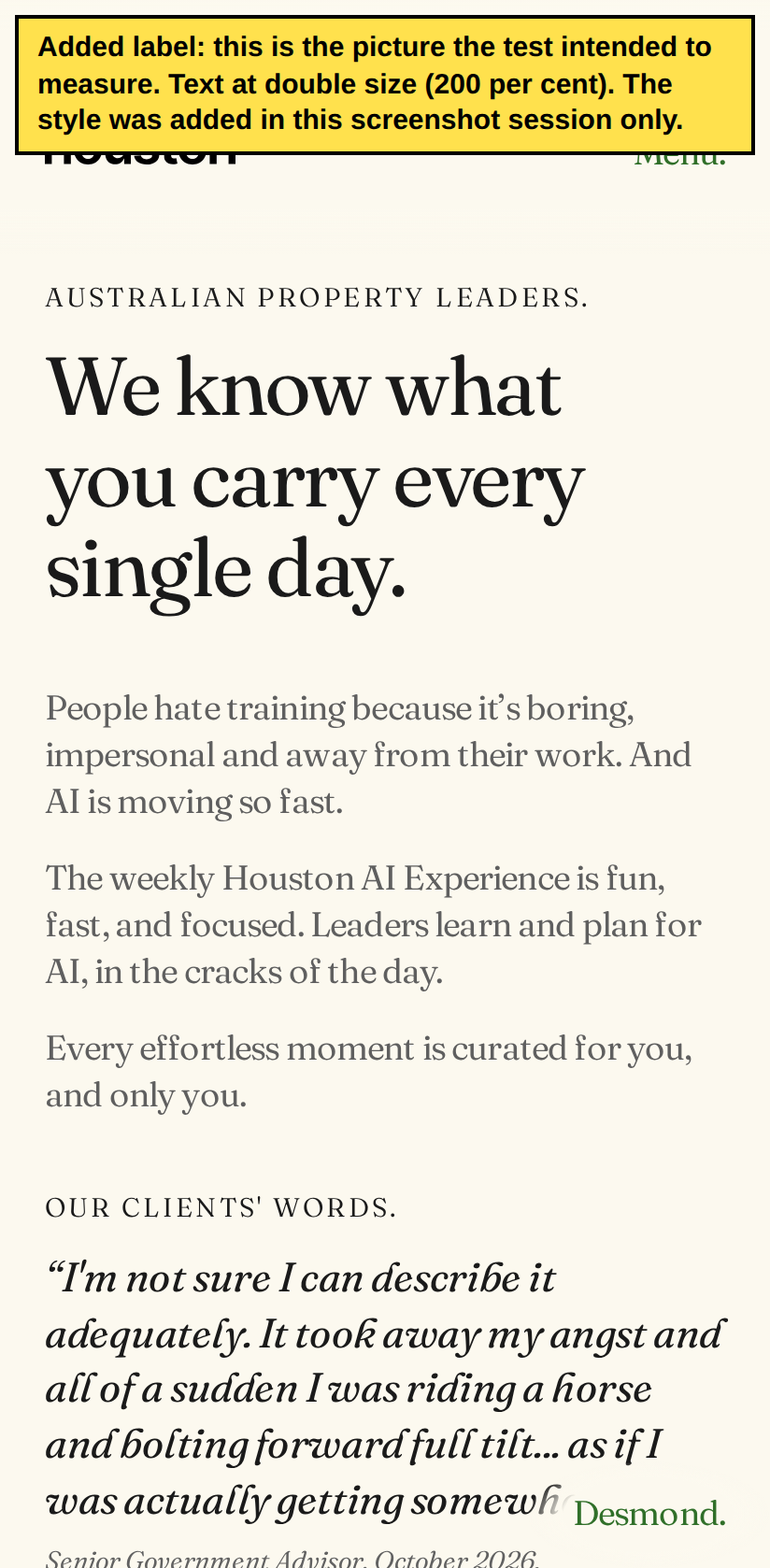
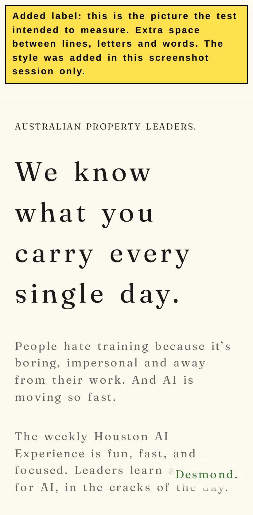
To show what the test intended to measure, I took the same two styles and applied them in a separate screenshot session at one size, a Pixel 7 phone, 412 by 839 pixels, in Chrome (Chromium). In that session only, the security setting was switched off. I then made the same two measurements the test makes. With double-size text, the page was 412 pixels wide in a 412 pixel window, so it did not scroll sideways, and 0 boxes cut off their text. With extra spacing, the result was the same: 412 pixels wide in a 412 pixel window, and 0 boxes cut off their text. This is one size in one browser. It is not a result for the other 54 sizes.
The pictures also show something the test would not report. With the base text size doubled, the text on the page did not get bigger. This is because the website sets its text sizes in pixels. A size in pixels does not follow the base text size. So a visitor who sets a larger text size in their browser settings, without zooming the whole page, would see the same text size on this page.
Option one: change the check
The test settings file, tests/playwright.config.ts, could tell the test browser to accept the test's own styles, with the setting bypassCSP: true. The website and its security setting would stay exactly as they are. The 110 checks would then measure the page at every size. Separately, the double-size test could be changed to enlarge the whole page, the way browser zoom does, because the current test does not enlarge text that is set in pixels.
Option two: change the website
The Worker could send a different security setting when it runs on a test computer, in the same way it already sends a different search engine setting there. Visitors to projecthouston.ai would keep the strict setting. Separately, the website could set its text sizes in rem units instead of pixels, so that text grows with the visitor's base text size. That changes src/assets/css/site.css and the brand token file, and needs your yes. The sizes would look the same at the normal text size.
Every screen size in this group (110 rows)
| Screen size | Browser | Test |
|---|---|---|
| Phone, Android 320, 320 by 568 pixels | Chrome (Chromium) | Double-size text |
| Phone, Android 320, 320 by 568 pixels | Chrome (Chromium) | Text spacing |
| Phone, Galaxy Z Fold 7 cover screen, 360 by 764 pixels | Chrome (Chromium) | Double-size text |
| Phone, Galaxy Z Fold 7 cover screen, 360 by 764 pixels | Chrome (Chromium) | Text spacing |
| Phone, Galaxy S24, 360 by 780 pixels | Chrome (Chromium) | Double-size text |
| Phone, Galaxy S24, 360 by 780 pixels | Chrome (Chromium) | Text spacing |
| Phone, Android 384, 384 by 832 pixels | Chrome (Chromium) | Double-size text |
| Phone, Android 384, 384 by 832 pixels | Chrome (Chromium) | Text spacing |
| Phone, Android 390, 390 by 844 pixels | Chrome (Chromium) | Double-size text |
| Phone, Android 390, 390 by 844 pixels | Chrome (Chromium) | Text spacing |
| Phone, Pixel 7, 412 by 839 pixels | Chrome (Chromium) | Double-size text |
| Phone, Pixel 7, 412 by 839 pixels | Chrome (Chromium) | Text spacing |
| Phone, Android 320 turned sideways, 568 by 320 pixels | Chrome (Chromium) | Double-size text |
| Phone, Android 320 turned sideways, 568 by 320 pixels | Chrome (Chromium) | Text spacing |
| Tablet, Android tablet 768, 768 by 1024 pixels | Chrome (Chromium) | Double-size text |
| Tablet, Android tablet 768, 768 by 1024 pixels | Chrome (Chromium) | Text spacing |
| Phone, Galaxy S24 turned sideways, 780 by 360 pixels | Chrome (Chromium) | Double-size text |
| Phone, Galaxy S24 turned sideways, 780 by 360 pixels | Chrome (Chromium) | Text spacing |
| Phone, Galaxy Z Fold 7 cover screen turned sideways, 788 by 308 pixels | Chrome (Chromium) | Double-size text |
| Phone, Galaxy Z Fold 7 cover screen turned sideways, 788 by 308 pixels | Chrome (Chromium) | Text spacing |
| Tablet, Nexus 10, 800 by 1280 pixels | Chrome (Chromium) | Double-size text |
| Tablet, Nexus 10, 800 by 1280 pixels | Chrome (Chromium) | Text spacing |
| Phone, Android 384 turned sideways, 832 by 384 pixels | Chrome (Chromium) | Double-size text |
| Phone, Android 384 turned sideways, 832 by 384 pixels | Chrome (Chromium) | Text spacing |
| Phone, Android 390 turned sideways, 844 by 390 pixels | Chrome (Chromium) | Double-size text |
| Phone, Android 390 turned sideways, 844 by 390 pixels | Chrome (Chromium) | Text spacing |
| Phone, Pixel 7 turned sideways, 863 by 360 pixels | Chrome (Chromium) | Double-size text |
| Phone, Pixel 7 turned sideways, 863 by 360 pixels | Chrome (Chromium) | Text spacing |
| Phone, Galaxy Z Fold 7, 984 by 1016 pixels | Chrome (Chromium) | Double-size text |
| Phone, Galaxy Z Fold 7, 984 by 1016 pixels | Chrome (Chromium) | Text spacing |
| Tablet, Android tablet 768 turned sideways, 1024 by 768 pixels | Chrome (Chromium) | Double-size text |
| Tablet, Android tablet 768 turned sideways, 1024 by 768 pixels | Chrome (Chromium) | Text spacing |
| Phone, Galaxy Z Fold 7 turned sideways, 1040 by 932 pixels | Chrome (Chromium) | Double-size text |
| Phone, Galaxy Z Fold 7 turned sideways, 1040 by 932 pixels | Chrome (Chromium) | Text spacing |
| Desktop or laptop screen, 1280 by 720 pixels | Chrome (Chromium) | Double-size text |
| Desktop or laptop screen, 1280 by 720 pixels | Chrome (Chromium) | Text spacing |
| Tablet, Nexus 10 turned sideways, 1280 by 800 pixels | Chrome (Chromium) | Double-size text |
| Tablet, Nexus 10 turned sideways, 1280 by 800 pixels | Chrome (Chromium) | Text spacing |
| Desktop or laptop screen, 1366 by 768 pixels | Chrome (Chromium) | Double-size text |
| Desktop or laptop screen, 1366 by 768 pixels | Chrome (Chromium) | Text spacing |
| Desktop or laptop screen, 1440 by 900 pixels | Chrome (Chromium) | Double-size text |
| Desktop or laptop screen, 1440 by 900 pixels | Chrome (Chromium) | Text spacing |
| Desktop or laptop screen, 1536 by 864 pixels | Chrome (Chromium) | Double-size text |
| Desktop or laptop screen, 1536 by 864 pixels | Chrome (Chromium) | Text spacing |
| Desktop or laptop screen, 1920 by 1080 pixels | Chrome (Chromium) | Double-size text |
| Desktop or laptop screen, 1920 by 1080 pixels | Chrome (Chromium) | Text spacing |
| Desktop or laptop screen, 2560 by 1440 pixels | Chrome (Chromium) | Double-size text |
| Desktop or laptop screen, 2560 by 1440 pixels | Chrome (Chromium) | Text spacing |
| Desktop or laptop screen, 3440 by 1440 pixels | Chrome (Chromium) | Double-size text |
| Desktop or laptop screen, 3440 by 1440 pixels | Chrome (Chromium) | Text spacing |
| Desktop or laptop screen, 3840 by 2160 pixels | Chrome (Chromium) | Double-size text |
| Desktop or laptop screen, 3840 by 2160 pixels | Chrome (Chromium) | Text spacing |
| Phone, iPhone SE, 320 by 568 pixels | Safari (WebKit) | Double-size text |
| Phone, iPhone SE, 320 by 568 pixels | Safari (WebKit) | Text spacing |
| Phone, iPhone SE 3rd generation, 375 by 667 pixels | Safari (WebKit) | Double-size text |
| Phone, iPhone SE 3rd generation, 375 by 667 pixels | Safari (WebKit) | Text spacing |
| Phone, iPhone X, 375 by 812 pixels | Safari (WebKit) | Double-size text |
| Phone, iPhone X, 375 by 812 pixels | Safari (WebKit) | Text spacing |
| Phone, iPhone 14, 390 by 664 pixels | Safari (WebKit) | Double-size text |
| Phone, iPhone 14, 390 by 664 pixels | Safari (WebKit) | Text spacing |
| Phone, iPhone 17, 402 by 681 pixels | Safari (WebKit) | Double-size text |
| Phone, iPhone 17, 402 by 681 pixels | Safari (WebKit) | Text spacing |
| Phone, iPhone 11, 414 by 715 pixels | Safari (WebKit) | Double-size text |
| Phone, iPhone 11, 414 by 715 pixels | Safari (WebKit) | Text spacing |
| Phone, iPhone 17 Pro Max, 440 by 763 pixels | Safari (WebKit) | Double-size text |
| Phone, iPhone 17 Pro Max, 440 by 763 pixels | Safari (WebKit) | Text spacing |
| Phone, iPhone SE turned sideways, 568 by 320 pixels | Safari (WebKit) | Double-size text |
| Phone, iPhone SE turned sideways, 568 by 320 pixels | Safari (WebKit) | Text spacing |
| Phone, iPhone SE 3rd generation turned sideways, 667 by 375 pixels | Safari (WebKit) | Double-size text |
| Phone, iPhone SE 3rd generation turned sideways, 667 by 375 pixels | Safari (WebKit) | Text spacing |
| Phone, iPhone 14 turned sideways, 750 by 340 pixels | Safari (WebKit) | Double-size text |
| Phone, iPhone 14 turned sideways, 750 by 340 pixels | Safari (WebKit) | Text spacing |
| Phone, iPhone 17 turned sideways, 756 by 352 pixels | Safari (WebKit) | Double-size text |
| Phone, iPhone 17 turned sideways, 756 by 352 pixels | Safari (WebKit) | Text spacing |
| Tablet, iPad mini, 768 by 1024 pixels | Safari (WebKit) | Double-size text |
| Tablet, iPad mini, 768 by 1024 pixels | Safari (WebKit) | Text spacing |
| Phone, iPhone 11 turned sideways, 800 by 364 pixels | Safari (WebKit) | Double-size text |
| Phone, iPhone 11 turned sideways, 800 by 364 pixels | Safari (WebKit) | Text spacing |
| Tablet, iPad generation 7, 810 by 1080 pixels | Safari (WebKit) | Double-size text |
| Tablet, iPad generation 7, 810 by 1080 pixels | Safari (WebKit) | Text spacing |
| Phone, iPhone X turned sideways, 812 by 375 pixels | Safari (WebKit) | Double-size text |
| Phone, iPhone X turned sideways, 812 by 375 pixels | Safari (WebKit) | Text spacing |
| Tablet, iPad 820, 820 by 1180 pixels | Safari (WebKit) | Double-size text |
| Tablet, iPad 820, 820 by 1180 pixels | Safari (WebKit) | Text spacing |
| Phone, iPhone 17 Pro Max turned sideways, 838 by 390 pixels | Safari (WebKit) | Double-size text |
| Phone, iPhone 17 Pro Max turned sideways, 838 by 390 pixels | Safari (WebKit) | Text spacing |
| Tablet, iPad mini turned sideways, 1024 by 768 pixels | Safari (WebKit) | Double-size text |
| Tablet, iPad mini turned sideways, 1024 by 768 pixels | Safari (WebKit) | Text spacing |
| Tablet, iPad generation 7 turned sideways, 1080 by 810 pixels | Safari (WebKit) | Double-size text |
| Tablet, iPad generation 7 turned sideways, 1080 by 810 pixels | Safari (WebKit) | Text spacing |
| Tablet, iPad 820 turned sideways, 1180 by 820 pixels | Safari (WebKit) | Double-size text |
| Tablet, iPad 820 turned sideways, 1180 by 820 pixels | Safari (WebKit) | Text spacing |
| Desktop or laptop screen, 1280 by 720 pixels | Safari (WebKit) | Double-size text |
| Desktop or laptop screen, 1280 by 720 pixels | Safari (WebKit) | Text spacing |
| Desktop or laptop screen, 1366 by 768 pixels | Safari (WebKit) | Double-size text |
| Desktop or laptop screen, 1366 by 768 pixels | Safari (WebKit) | Text spacing |
| Desktop or laptop screen, 1440 by 900 pixels | Safari (WebKit) | Double-size text |
| Desktop or laptop screen, 1440 by 900 pixels | Safari (WebKit) | Text spacing |
| Desktop or laptop screen, 1536 by 864 pixels | Safari (WebKit) | Double-size text |
| Desktop or laptop screen, 1536 by 864 pixels | Safari (WebKit) | Text spacing |
| Desktop or laptop screen, 1920 by 1080 pixels | Safari (WebKit) | Double-size text |
| Desktop or laptop screen, 1920 by 1080 pixels | Safari (WebKit) | Text spacing |
| Desktop or laptop screen, 1280 by 720 pixels | Firefox | Double-size text |
| Desktop or laptop screen, 1280 by 720 pixels | Firefox | Text spacing |
| Desktop or laptop screen, 1366 by 768 pixels | Firefox | Double-size text |
| Desktop or laptop screen, 1366 by 768 pixels | Firefox | Text spacing |
| Desktop or laptop screen, 1536 by 864 pixels | Firefox | Double-size text |
| Desktop or laptop screen, 1536 by 864 pixels | Firefox | Text spacing |
| Desktop or laptop screen, 1920 by 1080 pixels | Firefox | Double-size text |
| Desktop or laptop screen, 1920 by 1080 pixels | Firefox | Text spacing |
Group 2. The keyboard focus mark is an underline, not an outline: 55 checks
Chrome (Chromium): 26, Safari (WebKit): 25, Firefox: 4. Total: 55. This test failed at every screen size in every browser.
What the check tests
Some visitors use the Tab key on a keyboard, instead of a mouse, to move from one link or button to the next. The item they have reached is said to have focus. The browser must show a visible mark on it. The test presses Tab through the whole page. For each item that receives focus, it checks two things. The item must show an outline, which is a line drawn around it, at least 2 pixels thick. The item must not be hidden under a part of the page that stays fixed at the top of the screen, such as the header.
What failed
Every item that received focus had no outline. The website shows focus with a different mark: a green underline 2 pixels thick, 3 pixels below the words. The test only looks for an outline, so it counted every item as a failure. At 31 screen sizes, 15 items received focus and all 15 failed. At 24 screen sizes, 21 items received focus and all 21 failed. The 6 extra items at the wider sizes are the buttons for Jen, Hugh, George, Grace, Pearl and Ray, which only appear at those sizes. 31 + 24 = 55.
The test also found a second problem. The first item on the page is the link "Skip to the page.", which lets a keyboard visitor jump past the header. When it receives focus, it sits under the header, so it cannot be seen. This happened at 49 of the 55 sizes. It did not happen at the 6 sizes that are 1920 pixels wide or wider.
The list also includes two narration strips, for Rex and for Sky, which can receive focus. The website's style file turns their outline off and gives them no underline. The header links "Project Houston, home", "Call Simon." and "Menu." appear twice in the list because the same three links are repeated at the bottom of the page.
What it means for a visitor
A keyboard visitor sees the 2 pixel underline on links and buttons. A keyboard visitor who presses Tab once at the top of the page does not see the "Skip to the page." link, because the header covers it. When focus is on the Rex or Sky strip, there is no mark from the website's style file.


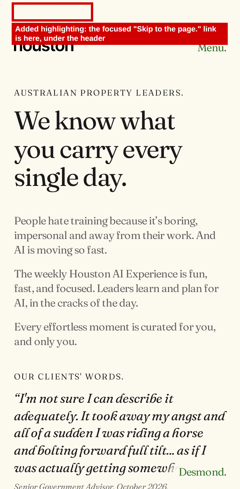
Option one: change the check
The test could accept an underline at least 2 pixels thick as a focus mark, as well as an outline. The 2 pixel underline would then pass. The "Skip to the page." link would still fail at the 49 sizes where the header covers it, and the Rex and Sky strips would still fail because they have no mark.
Option two: change the website
The website could draw a box outline around every focused item, as in the mock-up. Your brand rules in docs/rules.md say "No lines, boxes, cards, shadows, or rounded corners", so this needs your yes. The "Skip to the page." link could also be placed above the header when it has focus, and the Rex and Sky strips could be given a focus mark.
Every screen size in this group (55 rows)
| Screen size | Browser | What the test found |
|---|---|---|
| Phone, Android 320, 320 by 568 pixels | Chrome (Chromium) | 15 items without an outline. Skip link covered by the header: yes. |
| Phone, Galaxy Z Fold 7 cover screen, 360 by 764 pixels | Chrome (Chromium) | 15 items without an outline. Skip link covered by the header: yes. |
| Phone, Galaxy S24, 360 by 780 pixels | Chrome (Chromium) | 15 items without an outline. Skip link covered by the header: yes. |
| Phone, Android 384, 384 by 832 pixels | Chrome (Chromium) | 15 items without an outline. Skip link covered by the header: yes. |
| Phone, Android 390, 390 by 844 pixels | Chrome (Chromium) | 15 items without an outline. Skip link covered by the header: yes. |
| Phone, Pixel 7, 412 by 839 pixels | Chrome (Chromium) | 15 items without an outline. Skip link covered by the header: yes. |
| Phone, Android 320 turned sideways, 568 by 320 pixels | Chrome (Chromium) | 15 items without an outline. Skip link covered by the header: yes. |
| Tablet, Android tablet 768, 768 by 1024 pixels | Chrome (Chromium) | 15 items without an outline. Skip link covered by the header: yes. |
| Phone, Galaxy S24 turned sideways, 780 by 360 pixels | Chrome (Chromium) | 15 items without an outline. Skip link covered by the header: yes. |
| Phone, Galaxy Z Fold 7 cover screen turned sideways, 788 by 308 pixels | Chrome (Chromium) | 15 items without an outline. Skip link covered by the header: yes. |
| Tablet, Nexus 10, 800 by 1280 pixels | Chrome (Chromium) | 15 items without an outline. Skip link covered by the header: yes. |
| Phone, Android 384 turned sideways, 832 by 384 pixels | Chrome (Chromium) | 15 items without an outline. Skip link covered by the header: yes. |
| Phone, Android 390 turned sideways, 844 by 390 pixels | Chrome (Chromium) | 15 items without an outline. Skip link covered by the header: yes. |
| Phone, Pixel 7 turned sideways, 863 by 360 pixels | Chrome (Chromium) | 15 items without an outline. Skip link covered by the header: yes. |
| Phone, Galaxy Z Fold 7, 984 by 1016 pixels | Chrome (Chromium) | 21 items without an outline. Skip link covered by the header: yes. |
| Tablet, Android tablet 768 turned sideways, 1024 by 768 pixels | Chrome (Chromium) | 21 items without an outline. Skip link covered by the header: yes. |
| Phone, Galaxy Z Fold 7 turned sideways, 1040 by 932 pixels | Chrome (Chromium) | 21 items without an outline. Skip link covered by the header: yes. |
| Desktop or laptop screen, 1280 by 720 pixels | Chrome (Chromium) | 21 items without an outline. Skip link covered by the header: yes. |
| Tablet, Nexus 10 turned sideways, 1280 by 800 pixels | Chrome (Chromium) | 21 items without an outline. Skip link covered by the header: yes. |
| Desktop or laptop screen, 1366 by 768 pixels | Chrome (Chromium) | 21 items without an outline. Skip link covered by the header: yes. |
| Desktop or laptop screen, 1440 by 900 pixels | Chrome (Chromium) | 21 items without an outline. Skip link covered by the header: yes. |
| Desktop or laptop screen, 1536 by 864 pixels | Chrome (Chromium) | 21 items without an outline. Skip link covered by the header: yes. |
| Desktop or laptop screen, 1920 by 1080 pixels | Chrome (Chromium) | 21 items without an outline. Skip link covered by the header: no. |
| Desktop or laptop screen, 2560 by 1440 pixels | Chrome (Chromium) | 21 items without an outline. Skip link covered by the header: no. |
| Desktop or laptop screen, 3440 by 1440 pixels | Chrome (Chromium) | 21 items without an outline. Skip link covered by the header: no. |
| Desktop or laptop screen, 3840 by 2160 pixels | Chrome (Chromium) | 21 items without an outline. Skip link covered by the header: no. |
| Phone, iPhone SE, 320 by 568 pixels | Safari (WebKit) | 15 items without an outline. Skip link covered by the header: yes. |
| Phone, iPhone SE 3rd generation, 375 by 667 pixels | Safari (WebKit) | 15 items without an outline. Skip link covered by the header: yes. |
| Phone, iPhone X, 375 by 812 pixels | Safari (WebKit) | 15 items without an outline. Skip link covered by the header: yes. |
| Phone, iPhone 14, 390 by 664 pixels | Safari (WebKit) | 15 items without an outline. Skip link covered by the header: yes. |
| Phone, iPhone 17, 402 by 681 pixels | Safari (WebKit) | 15 items without an outline. Skip link covered by the header: yes. |
| Phone, iPhone 11, 414 by 715 pixels | Safari (WebKit) | 15 items without an outline. Skip link covered by the header: yes. |
| Phone, iPhone 17 Pro Max, 440 by 763 pixels | Safari (WebKit) | 15 items without an outline. Skip link covered by the header: yes. |
| Phone, iPhone SE turned sideways, 568 by 320 pixels | Safari (WebKit) | 15 items without an outline. Skip link covered by the header: yes. |
| Phone, iPhone SE 3rd generation turned sideways, 667 by 375 pixels | Safari (WebKit) | 15 items without an outline. Skip link covered by the header: yes. |
| Phone, iPhone 14 turned sideways, 750 by 340 pixels | Safari (WebKit) | 15 items without an outline. Skip link covered by the header: yes. |
| Phone, iPhone 17 turned sideways, 756 by 352 pixels | Safari (WebKit) | 15 items without an outline. Skip link covered by the header: yes. |
| Tablet, iPad mini, 768 by 1024 pixels | Safari (WebKit) | 15 items without an outline. Skip link covered by the header: yes. |
| Phone, iPhone 11 turned sideways, 800 by 364 pixels | Safari (WebKit) | 15 items without an outline. Skip link covered by the header: yes. |
| Tablet, iPad generation 7, 810 by 1080 pixels | Safari (WebKit) | 15 items without an outline. Skip link covered by the header: yes. |
| Phone, iPhone X turned sideways, 812 by 375 pixels | Safari (WebKit) | 15 items without an outline. Skip link covered by the header: yes. |
| Tablet, iPad 820, 820 by 1180 pixels | Safari (WebKit) | 15 items without an outline. Skip link covered by the header: yes. |
| Phone, iPhone 17 Pro Max turned sideways, 838 by 390 pixels | Safari (WebKit) | 15 items without an outline. Skip link covered by the header: yes. |
| Tablet, iPad mini turned sideways, 1024 by 768 pixels | Safari (WebKit) | 21 items without an outline. Skip link covered by the header: yes. |
| Tablet, iPad generation 7 turned sideways, 1080 by 810 pixels | Safari (WebKit) | 21 items without an outline. Skip link covered by the header: yes. |
| Tablet, iPad 820 turned sideways, 1180 by 820 pixels | Safari (WebKit) | 21 items without an outline. Skip link covered by the header: yes. |
| Desktop or laptop screen, 1280 by 720 pixels | Safari (WebKit) | 21 items without an outline. Skip link covered by the header: yes. |
| Desktop or laptop screen, 1366 by 768 pixels | Safari (WebKit) | 21 items without an outline. Skip link covered by the header: yes. |
| Desktop or laptop screen, 1440 by 900 pixels | Safari (WebKit) | 21 items without an outline. Skip link covered by the header: yes. |
| Desktop or laptop screen, 1536 by 864 pixels | Safari (WebKit) | 21 items without an outline. Skip link covered by the header: yes. |
| Desktop or laptop screen, 1920 by 1080 pixels | Safari (WebKit) | 21 items without an outline. Skip link covered by the header: no. |
| Desktop or laptop screen, 1280 by 720 pixels | Firefox | 21 items without an outline. Skip link covered by the header: yes. |
| Desktop or laptop screen, 1366 by 768 pixels | Firefox | 21 items without an outline. Skip link covered by the header: yes. |
| Desktop or laptop screen, 1536 by 864 pixels | Firefox | 21 items without an outline. Skip link covered by the header: yes. |
| Desktop or laptop screen, 1920 by 1080 pixels | Firefox | 21 items without an outline. Skip link covered by the header: no. |
Group 3. No approved pictures exist yet, because this was the first run: 55 checks
Chrome (Chromium): 26, Safari (WebKit): 25, Firefox: 4. Total: 55. This test failed at every screen size in every browser.
What the check tests
The test takes a picture of the whole page at each screen size and compares it with an approved picture. If more than 1 in every 100 dots on the screen differs, the check fails. This catches changes to the look of the page that nobody meant to make.
What failed
This was the first run, so there was no approved picture. For every size, the test saved its picture as the starting point and reported "A snapshot doesn't exist ... writing actual". All 55 checks failed this way. The 55 pictures are saved on the test computer only. They are not in the repository. Together they take 170 megabytes. Each picture would only match pictures taken on the same kind of computer, which here is Linux.
What it means for a visitor
Nothing. This failure says nothing about the page. It only says that no picture has been approved yet.

Option one: change the check
A person could look at the 55 pictures of the current page and approve them now. The next run would then pass these 55 checks, unless the page changes. The home page will be rebuilt, so these pictures would have to be replaced and looked at again after the rebuild.
Option two: change the website
No change to the website would make a first run pass, because there is nothing to compare against on a first run. The pictures could instead be approved for the first time after the rebuilt home page passes the other checks.
Every screen size in this group (55 rows)
| Screen size | Browser |
|---|---|
| Phone, Android 320, 320 by 568 pixels | Chrome (Chromium) |
| Phone, Galaxy Z Fold 7 cover screen, 360 by 764 pixels | Chrome (Chromium) |
| Phone, Galaxy S24, 360 by 780 pixels | Chrome (Chromium) |
| Phone, Android 384, 384 by 832 pixels | Chrome (Chromium) |
| Phone, Android 390, 390 by 844 pixels | Chrome (Chromium) |
| Phone, Pixel 7, 412 by 839 pixels | Chrome (Chromium) |
| Phone, Android 320 turned sideways, 568 by 320 pixels | Chrome (Chromium) |
| Tablet, Android tablet 768, 768 by 1024 pixels | Chrome (Chromium) |
| Phone, Galaxy S24 turned sideways, 780 by 360 pixels | Chrome (Chromium) |
| Phone, Galaxy Z Fold 7 cover screen turned sideways, 788 by 308 pixels | Chrome (Chromium) |
| Tablet, Nexus 10, 800 by 1280 pixels | Chrome (Chromium) |
| Phone, Android 384 turned sideways, 832 by 384 pixels | Chrome (Chromium) |
| Phone, Android 390 turned sideways, 844 by 390 pixels | Chrome (Chromium) |
| Phone, Pixel 7 turned sideways, 863 by 360 pixels | Chrome (Chromium) |
| Phone, Galaxy Z Fold 7, 984 by 1016 pixels | Chrome (Chromium) |
| Tablet, Android tablet 768 turned sideways, 1024 by 768 pixels | Chrome (Chromium) |
| Phone, Galaxy Z Fold 7 turned sideways, 1040 by 932 pixels | Chrome (Chromium) |
| Desktop or laptop screen, 1280 by 720 pixels | Chrome (Chromium) |
| Tablet, Nexus 10 turned sideways, 1280 by 800 pixels | Chrome (Chromium) |
| Desktop or laptop screen, 1366 by 768 pixels | Chrome (Chromium) |
| Desktop or laptop screen, 1440 by 900 pixels | Chrome (Chromium) |
| Desktop or laptop screen, 1536 by 864 pixels | Chrome (Chromium) |
| Desktop or laptop screen, 1920 by 1080 pixels | Chrome (Chromium) |
| Desktop or laptop screen, 2560 by 1440 pixels | Chrome (Chromium) |
| Desktop or laptop screen, 3440 by 1440 pixels | Chrome (Chromium) |
| Desktop or laptop screen, 3840 by 2160 pixels | Chrome (Chromium) |
| Phone, iPhone SE, 320 by 568 pixels | Safari (WebKit) |
| Phone, iPhone SE 3rd generation, 375 by 667 pixels | Safari (WebKit) |
| Phone, iPhone X, 375 by 812 pixels | Safari (WebKit) |
| Phone, iPhone 14, 390 by 664 pixels | Safari (WebKit) |
| Phone, iPhone 17, 402 by 681 pixels | Safari (WebKit) |
| Phone, iPhone 11, 414 by 715 pixels | Safari (WebKit) |
| Phone, iPhone 17 Pro Max, 440 by 763 pixels | Safari (WebKit) |
| Phone, iPhone SE turned sideways, 568 by 320 pixels | Safari (WebKit) |
| Phone, iPhone SE 3rd generation turned sideways, 667 by 375 pixels | Safari (WebKit) |
| Phone, iPhone 14 turned sideways, 750 by 340 pixels | Safari (WebKit) |
| Phone, iPhone 17 turned sideways, 756 by 352 pixels | Safari (WebKit) |
| Tablet, iPad mini, 768 by 1024 pixels | Safari (WebKit) |
| Phone, iPhone 11 turned sideways, 800 by 364 pixels | Safari (WebKit) |
| Tablet, iPad generation 7, 810 by 1080 pixels | Safari (WebKit) |
| Phone, iPhone X turned sideways, 812 by 375 pixels | Safari (WebKit) |
| Tablet, iPad 820, 820 by 1180 pixels | Safari (WebKit) |
| Phone, iPhone 17 Pro Max turned sideways, 838 by 390 pixels | Safari (WebKit) |
| Tablet, iPad mini turned sideways, 1024 by 768 pixels | Safari (WebKit) |
| Tablet, iPad generation 7 turned sideways, 1080 by 810 pixels | Safari (WebKit) |
| Tablet, iPad 820 turned sideways, 1180 by 820 pixels | Safari (WebKit) |
| Desktop or laptop screen, 1280 by 720 pixels | Safari (WebKit) |
| Desktop or laptop screen, 1366 by 768 pixels | Safari (WebKit) |
| Desktop or laptop screen, 1440 by 900 pixels | Safari (WebKit) |
| Desktop or laptop screen, 1536 by 864 pixels | Safari (WebKit) |
| Desktop or laptop screen, 1920 by 1080 pixels | Safari (WebKit) |
| Desktop or laptop screen, 1280 by 720 pixels | Firefox |
| Desktop or laptop screen, 1366 by 768 pixels | Firefox |
| Desktop or laptop screen, 1536 by 864 pixels | Firefox |
| Desktop or laptop screen, 1920 by 1080 pixels | Firefox |
Group 4. The page has four Heading 1s, and the check expects one: 51 checks
Chrome (Chromium): 26, Safari (WebKit): 25, Firefox: 0. Total: 51. The 4 Firefox checks of the same test are in group 7, because they stopped earlier for a different reason.
What the check tests
The test switches JavaScript off and opens the page. It then checks, in this order, that the page has exactly one Heading 1 and that it can be seen, that the page has one main part with words in it, and that the menu links can be seen and used. A Heading 1 is the largest heading level. Screen readers use the headings to let a visitor jump around the page.
What failed
The page has four Heading 1s. The test found 4 where it expects 1, at all 51 of these sizes, and stopped there. Because it stopped at the first step, this run did not check the main part or the menu links with JavaScript off.
The four Heading 1s are "We know what you carry every single day.", "The weekly Houston AI Experience draws a line in the sand.", "Make confident decisions with AI every day." and "The Hare & The Tortoise for AI." Your decision of 30 October 2026 set these four. The website's own check, named "Two Heading 1s", in tests/checks/heading-ones.mjs, requires these four on the home page. The two sets of checks disagree.
What it means for a visitor
A visitor who reads the page sees no difference. A visitor who uses a screen reader and jumps between Heading 1s hears four top-level headings instead of one.

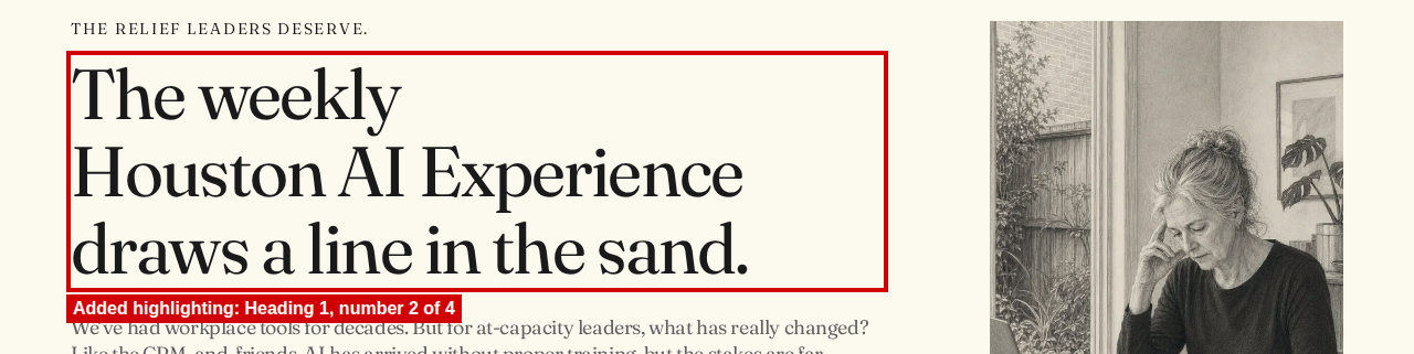


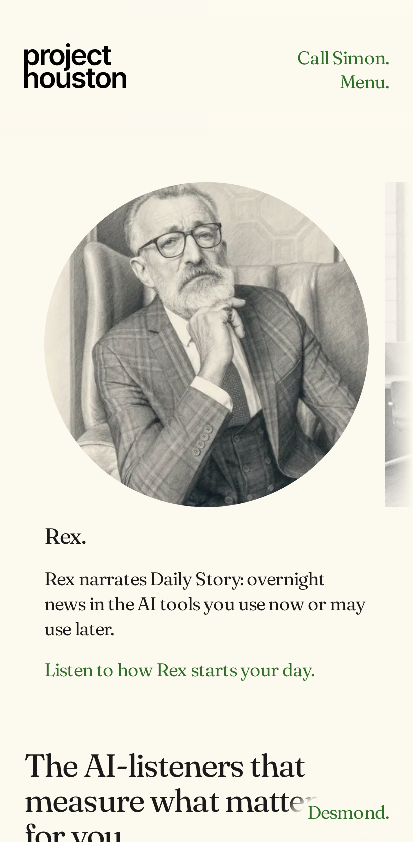
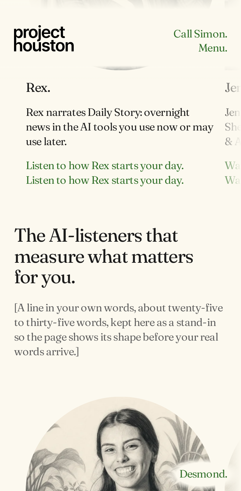
The pictures below compare the page with JavaScript on and with JavaScript off, at the same place on the page. The test did not reach this part. With JavaScript off, the line "Listen to how Rex starts your day." appears twice. The website has a plain link with these words for visitors without JavaScript, and a button with the same words that JavaScript shows. The button is marked as hidden, but a rule in src/assets/css/site.css, button.pearl-listen { display: block; }, makes it show anyway.
Option one: change the check
The test could accept four Heading 1s on the home page, to match your decision of 30 October 2026 and the website's own check. The test would then go on to check the main part and the menu links with JavaScript off.
Option two: change the website
The home page could keep one Heading 1 and mark the other three as the next heading level, Heading 2. The words would not change. The headings could keep the same look, because their size comes from a style name, not from the heading level. This reverses your decision of 30 October 2026 and needs your yes. The website's own check "Two Heading 1s" would then need to change too.
Every screen size in this group (51 rows)
| Screen size | Browser |
|---|---|
| Phone, Android 320, 320 by 568 pixels | Chrome (Chromium) |
| Phone, Galaxy Z Fold 7 cover screen, 360 by 764 pixels | Chrome (Chromium) |
| Phone, Galaxy S24, 360 by 780 pixels | Chrome (Chromium) |
| Phone, Android 384, 384 by 832 pixels | Chrome (Chromium) |
| Phone, Android 390, 390 by 844 pixels | Chrome (Chromium) |
| Phone, Pixel 7, 412 by 839 pixels | Chrome (Chromium) |
| Phone, Android 320 turned sideways, 568 by 320 pixels | Chrome (Chromium) |
| Tablet, Android tablet 768, 768 by 1024 pixels | Chrome (Chromium) |
| Phone, Galaxy S24 turned sideways, 780 by 360 pixels | Chrome (Chromium) |
| Phone, Galaxy Z Fold 7 cover screen turned sideways, 788 by 308 pixels | Chrome (Chromium) |
| Tablet, Nexus 10, 800 by 1280 pixels | Chrome (Chromium) |
| Phone, Android 384 turned sideways, 832 by 384 pixels | Chrome (Chromium) |
| Phone, Android 390 turned sideways, 844 by 390 pixels | Chrome (Chromium) |
| Phone, Pixel 7 turned sideways, 863 by 360 pixels | Chrome (Chromium) |
| Phone, Galaxy Z Fold 7, 984 by 1016 pixels | Chrome (Chromium) |
| Tablet, Android tablet 768 turned sideways, 1024 by 768 pixels | Chrome (Chromium) |
| Phone, Galaxy Z Fold 7 turned sideways, 1040 by 932 pixels | Chrome (Chromium) |
| Desktop or laptop screen, 1280 by 720 pixels | Chrome (Chromium) |
| Tablet, Nexus 10 turned sideways, 1280 by 800 pixels | Chrome (Chromium) |
| Desktop or laptop screen, 1366 by 768 pixels | Chrome (Chromium) |
| Desktop or laptop screen, 1440 by 900 pixels | Chrome (Chromium) |
| Desktop or laptop screen, 1536 by 864 pixels | Chrome (Chromium) |
| Desktop or laptop screen, 1920 by 1080 pixels | Chrome (Chromium) |
| Desktop or laptop screen, 2560 by 1440 pixels | Chrome (Chromium) |
| Desktop or laptop screen, 3440 by 1440 pixels | Chrome (Chromium) |
| Desktop or laptop screen, 3840 by 2160 pixels | Chrome (Chromium) |
| Phone, iPhone SE, 320 by 568 pixels | Safari (WebKit) |
| Phone, iPhone SE 3rd generation, 375 by 667 pixels | Safari (WebKit) |
| Phone, iPhone X, 375 by 812 pixels | Safari (WebKit) |
| Phone, iPhone 14, 390 by 664 pixels | Safari (WebKit) |
| Phone, iPhone 17, 402 by 681 pixels | Safari (WebKit) |
| Phone, iPhone 11, 414 by 715 pixels | Safari (WebKit) |
| Phone, iPhone 17 Pro Max, 440 by 763 pixels | Safari (WebKit) |
| Phone, iPhone SE turned sideways, 568 by 320 pixels | Safari (WebKit) |
| Phone, iPhone SE 3rd generation turned sideways, 667 by 375 pixels | Safari (WebKit) |
| Phone, iPhone 14 turned sideways, 750 by 340 pixels | Safari (WebKit) |
| Phone, iPhone 17 turned sideways, 756 by 352 pixels | Safari (WebKit) |
| Tablet, iPad mini, 768 by 1024 pixels | Safari (WebKit) |
| Phone, iPhone 11 turned sideways, 800 by 364 pixels | Safari (WebKit) |
| Tablet, iPad generation 7, 810 by 1080 pixels | Safari (WebKit) |
| Phone, iPhone X turned sideways, 812 by 375 pixels | Safari (WebKit) |
| Tablet, iPad 820, 820 by 1180 pixels | Safari (WebKit) |
| Phone, iPhone 17 Pro Max turned sideways, 838 by 390 pixels | Safari (WebKit) |
| Tablet, iPad mini turned sideways, 1024 by 768 pixels | Safari (WebKit) |
| Tablet, iPad generation 7 turned sideways, 1080 by 810 pixels | Safari (WebKit) |
| Tablet, iPad 820 turned sideways, 1180 by 820 pixels | Safari (WebKit) |
| Desktop or laptop screen, 1280 by 720 pixels | Safari (WebKit) |
| Desktop or laptop screen, 1366 by 768 pixels | Safari (WebKit) |
| Desktop or laptop screen, 1440 by 900 pixels | Safari (WebKit) |
| Desktop or laptop screen, 1536 by 864 pixels | Safari (WebKit) |
| Desktop or laptop screen, 1920 by 1080 pixels | Safari (WebKit) |
Group 5. Buttons shorter than 44 pixels on touch screens: 38 checks
Chrome (Chromium): 18, Safari (WebKit): 20, Firefox: 0. Total: 38. This test only runs at sizes that have a touch screen. Firefox is only tested at 4 desktop sizes without a touch screen, so it has no checks here. The 38 checks are every touch screen size tested.
What the check tests
On a touch screen, every button and every menu link must be at least 44 by 44 pixels, so it is easy to tap with a finger. A separate test, which passed at every size, checks the smaller limit of 24 by 24 pixels.
What failed
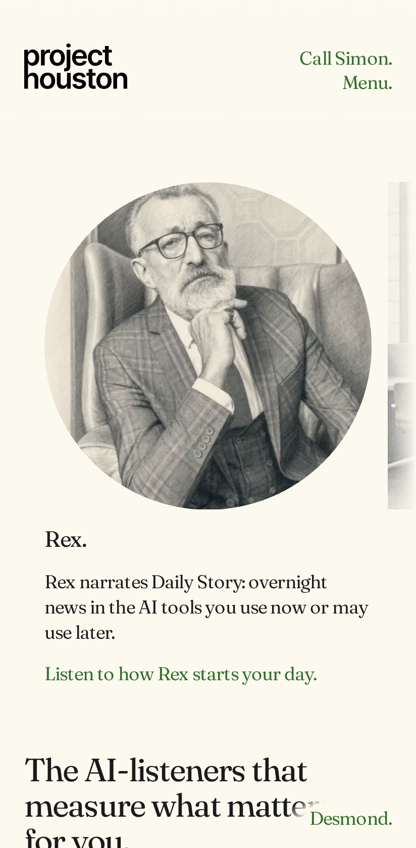
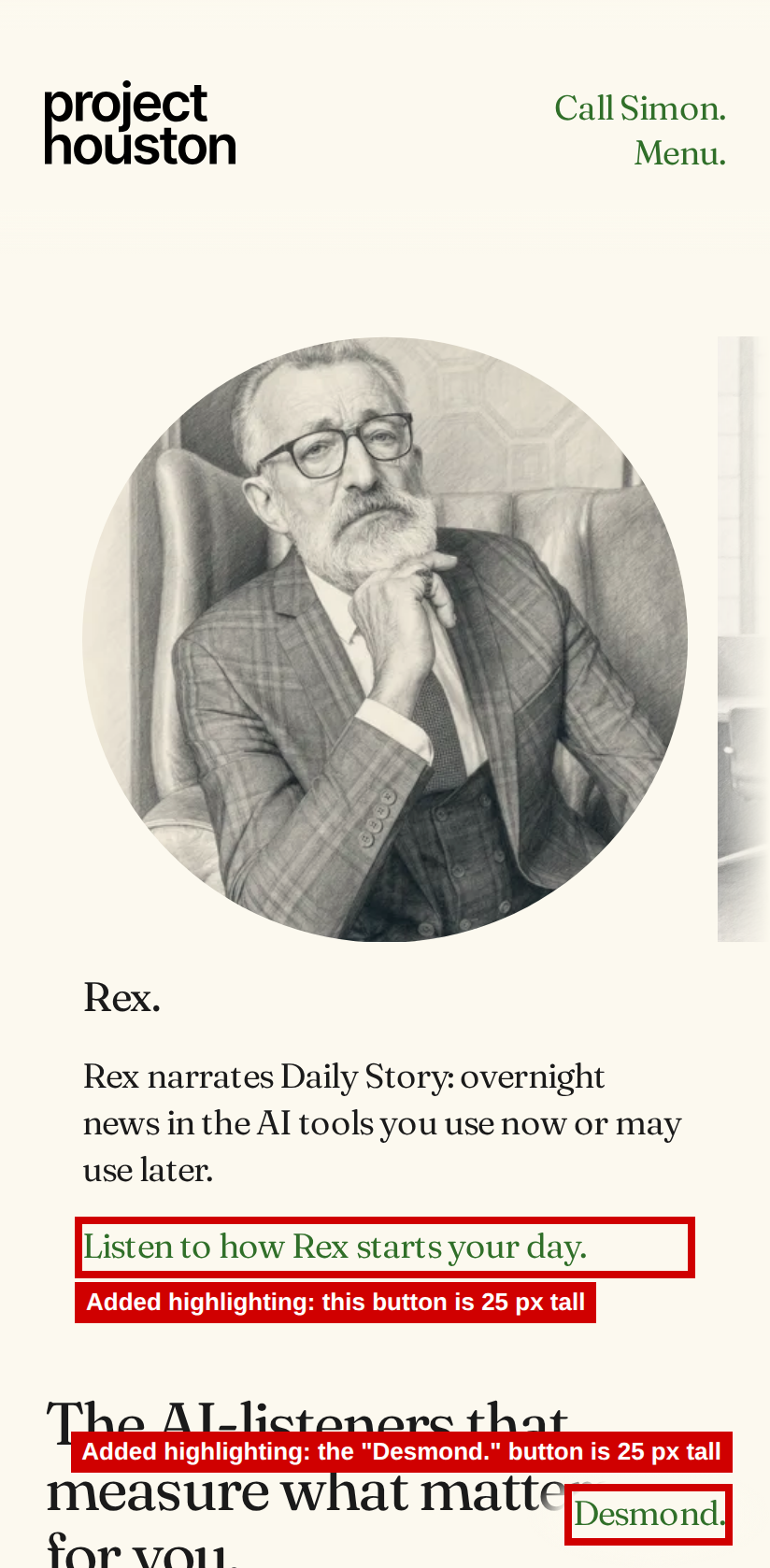
The "Desmond." button is between 81 and 84 pixels wide and between 24 and 25 pixels tall. It failed in all 38 checks. Several Listen and Watch buttons are also 24 or 25 pixels tall. This table counts in how many of the 38 checks each button was too small.
| Button | Checks where it was under 44 pixels |
|---|---|
| Desmond. | 38 |
| Listen to how Sky prepares you. | 33 |
| Listen to how Rex starts your day. | 31 |
| Listen how Sid audits your AI history. | 24 |
| Watch how you and Hugh work. | 3 |
| Watch how Grace sits in your week. | 1 |
| Listen to how Ray replays your week. | 1 |
What it means for a visitor
On a phone or tablet, the area a visitor can tap on these buttons is 24 or 25 pixels tall. A visitor with large fingers or unsteady hands may miss the button and tap next to it.
Option one: change the check
The test could accept buttons that look like a line of text, such as the Listen buttons and "Desmond.", if they meet the 24 by 24 pixel limit, which they already do. The 38 checks would then pass without any change to the page.
Option two: change the website
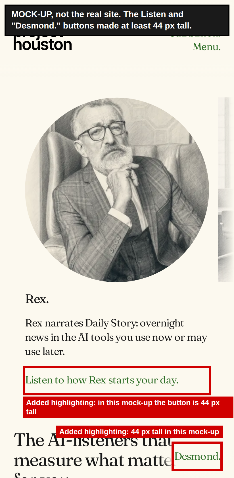
The website could make the tappable area of each of these buttons at least 44 pixels tall on touch screens. The words and the text size would stay the same. As the mock-up shows, there would be more space above and below each button. That changes spacing on the page and needs your yes.
Every screen size in this group (38 rows)
| Screen size | Browser | Buttons under 44 pixels, with their size |
|---|---|---|
| Phone, Android 320, 320 by 568 pixels | Chrome (Chromium) | "Desmond." 82 by 25 pixels |
| Phone, Galaxy Z Fold 7 cover screen, 360 by 764 pixels | Chrome (Chromium) | "Listen to how Rex starts your day." 272 by 25 pixels; "Listen to how Sky prepares you." 272 by 25 pixels; "Desmond." 82 by 25 pixels |
| Phone, Galaxy S24, 360 by 780 pixels | Chrome (Chromium) | "Listen to how Rex starts your day." 272 by 25 pixels; "Listen to how Sky prepares you." 272 by 25 pixels; "Desmond." 82 by 25 pixels |
| Phone, Android 384, 384 by 832 pixels | Chrome (Chromium) | "Listen to how Rex starts your day." 296 by 25 pixels; "Listen to how Sky prepares you." 296 by 25 pixels; "Desmond." 82 by 25 pixels |
| Phone, Android 390, 390 by 844 pixels | Chrome (Chromium) | "Listen how Sid audits your AI history." 302 by 25 pixels; "Listen to how Rex starts your day." 302 by 25 pixels; "Listen to how Sky prepares you." 302 by 25 pixels; "Desmond." 82 by 25 pixels |
| Phone, Pixel 7, 412 by 839 pixels | Chrome (Chromium) | "Listen how Sid audits your AI history." 324 by 25 pixels; "Listen to how Rex starts your day." 324 by 25 pixels; "Listen to how Sky prepares you." 324 by 25 pixels; "Desmond." 82 by 25 pixels |
| Phone, Android 320 turned sideways, 568 by 320 pixels | Chrome (Chromium) | "Listen how Sid audits your AI history." 480 by 25 pixels; "Listen to how Rex starts your day." 480 by 25 pixels; "Listen to how Sky prepares you." 480 by 25 pixels; "Desmond." 82 by 25 pixels |
| Tablet, Android tablet 768, 768 by 1024 pixels | Chrome (Chromium) | "Listen how Sid audits your AI history." 680 by 25 pixels; "Listen to how Rex starts your day." 680 by 25 pixels; "Listen to how Sky prepares you." 680 by 25 pixels; "Desmond." 82 by 25 pixels |
| Phone, Galaxy S24 turned sideways, 780 by 360 pixels | Chrome (Chromium) | "Listen how Sid audits your AI history." 692 by 25 pixels; "Listen to how Rex starts your day." 692 by 25 pixels; "Listen to how Sky prepares you." 692 by 25 pixels; "Desmond." 82 by 25 pixels |
| Phone, Galaxy Z Fold 7 cover screen turned sideways, 788 by 308 pixels | Chrome (Chromium) | "Listen how Sid audits your AI history." 700 by 25 pixels; "Listen to how Rex starts your day." 700 by 25 pixels; "Listen to how Sky prepares you." 700 by 25 pixels; "Desmond." 82 by 25 pixels |
| Tablet, Nexus 10, 800 by 1280 pixels | Chrome (Chromium) | "Listen how Sid audits your AI history." 712 by 25 pixels; "Listen to how Rex starts your day." 712 by 25 pixels; "Listen to how Sky prepares you." 712 by 25 pixels; "Desmond." 82 by 25 pixels |
| Phone, Android 384 turned sideways, 832 by 384 pixels | Chrome (Chromium) | "Listen how Sid audits your AI history." 744 by 25 pixels; "Listen to how Rex starts your day." 744 by 25 pixels; "Listen to how Sky prepares you." 744 by 25 pixels; "Desmond." 82 by 25 pixels |
| Phone, Android 390 turned sideways, 844 by 390 pixels | Chrome (Chromium) | "Listen how Sid audits your AI history." 756 by 25 pixels; "Listen to how Rex starts your day." 756 by 25 pixels; "Listen to how Sky prepares you." 756 by 25 pixels; "Desmond." 82 by 25 pixels |
| Phone, Pixel 7 turned sideways, 863 by 360 pixels | Chrome (Chromium) | "Listen how Sid audits your AI history." 775 by 25 pixels; "Listen to how Rex starts your day." 775 by 25 pixels; "Listen to how Sky prepares you." 775 by 25 pixels; "Desmond." 82 by 25 pixels |
| Phone, Galaxy Z Fold 7, 984 by 1016 pixels | Chrome (Chromium) | "Desmond." 81 by 24 pixels |
| Tablet, Android tablet 768 turned sideways, 1024 by 768 pixels | Chrome (Chromium) | "Desmond." 81 by 24 pixels |
| Phone, Galaxy Z Fold 7 turned sideways, 1040 by 932 pixels | Chrome (Chromium) | "Listen to how Sky prepares you." 251 by 24 pixels; "Desmond." 81 by 24 pixels |
| Tablet, Nexus 10 turned sideways, 1280 by 800 pixels | Chrome (Chromium) | "Watch how you and Hugh work." 256 by 24 pixels; "Listen to how Sky prepares you." 256 by 24 pixels; "Desmond." 81 by 24 pixels |
| Phone, iPhone SE, 320 by 568 pixels | Safari (WebKit) | "Desmond." 84 by 25 pixels |
| Phone, iPhone SE 3rd generation, 375 by 667 pixels | Safari (WebKit) | "Listen to how Rex starts your day." 287 by 25 pixels; "Listen to how Sky prepares you." 287 by 25 pixels; "Desmond." 84 by 25 pixels |
| Phone, iPhone X, 375 by 812 pixels | Safari (WebKit) | "Listen to how Rex starts your day." 287 by 25 pixels; "Listen to how Sky prepares you." 287 by 25 pixels; "Desmond." 84 by 25 pixels |
| Phone, iPhone 14, 390 by 664 pixels | Safari (WebKit) | "Listen to how Rex starts your day." 302 by 25 pixels; "Listen to how Sky prepares you." 302 by 25 pixels; "Desmond." 84 by 25 pixels |
| Phone, iPhone 17, 402 by 681 pixels | Safari (WebKit) | "Listen how Sid audits your AI history." 314 by 25 pixels; "Listen to how Rex starts your day." 314 by 25 pixels; "Listen to how Sky prepares you." 314 by 25 pixels; "Desmond." 84 by 25 pixels |
| Phone, iPhone 11, 414 by 715 pixels | Safari (WebKit) | "Listen how Sid audits your AI history." 326 by 25 pixels; "Listen to how Rex starts your day." 326 by 25 pixels; "Listen to how Sky prepares you." 326 by 25 pixels; "Desmond." 84 by 25 pixels |
| Phone, iPhone 17 Pro Max, 440 by 763 pixels | Safari (WebKit) | "Listen how Sid audits your AI history." 352 by 25 pixels; "Listen to how Rex starts your day." 352 by 25 pixels; "Listen to how Sky prepares you." 352 by 25 pixels; "Desmond." 84 by 25 pixels |
| Phone, iPhone SE turned sideways, 568 by 320 pixels | Safari (WebKit) | "Listen how Sid audits your AI history." 480 by 25 pixels; "Listen to how Rex starts your day." 480 by 25 pixels; "Listen to how Sky prepares you." 480 by 25 pixels; "Desmond." 84 by 25 pixels |
| Phone, iPhone SE 3rd generation turned sideways, 667 by 375 pixels | Safari (WebKit) | "Listen how Sid audits your AI history." 579 by 25 pixels; "Listen to how Rex starts your day." 579 by 25 pixels; "Listen to how Sky prepares you." 579 by 25 pixels; "Desmond." 84 by 25 pixels |
| Phone, iPhone 14 turned sideways, 750 by 340 pixels | Safari (WebKit) | "Listen how Sid audits your AI history." 662 by 25 pixels; "Listen to how Rex starts your day." 662 by 25 pixels; "Listen to how Sky prepares you." 662 by 25 pixels; "Desmond." 84 by 25 pixels |
| Phone, iPhone 17 turned sideways, 756 by 352 pixels | Safari (WebKit) | "Listen how Sid audits your AI history." 668 by 25 pixels; "Listen to how Rex starts your day." 668 by 25 pixels; "Listen to how Sky prepares you." 668 by 25 pixels; "Desmond." 84 by 25 pixels |
| Tablet, iPad mini, 768 by 1024 pixels | Safari (WebKit) | "Listen how Sid audits your AI history." 680 by 25 pixels; "Listen to how Rex starts your day." 680 by 25 pixels; "Listen to how Sky prepares you." 680 by 25 pixels; "Desmond." 84 by 25 pixels |
| Phone, iPhone 11 turned sideways, 800 by 364 pixels | Safari (WebKit) | "Listen how Sid audits your AI history." 712 by 25 pixels; "Listen to how Rex starts your day." 712 by 25 pixels; "Listen to how Sky prepares you." 712 by 25 pixels; "Desmond." 84 by 25 pixels |
| Tablet, iPad generation 7, 810 by 1080 pixels | Safari (WebKit) | "Listen how Sid audits your AI history." 722 by 25 pixels; "Listen to how Rex starts your day." 722 by 25 pixels; "Listen to how Sky prepares you." 722 by 25 pixels; "Desmond." 84 by 25 pixels |
| Phone, iPhone X turned sideways, 812 by 375 pixels | Safari (WebKit) | "Listen how Sid audits your AI history." 724 by 25 pixels; "Listen to how Rex starts your day." 724 by 25 pixels; "Listen to how Sky prepares you." 724 by 25 pixels; "Desmond." 84 by 25 pixels |
| Tablet, iPad 820, 820 by 1180 pixels | Safari (WebKit) | "Listen how Sid audits your AI history." 732 by 25 pixels; "Listen to how Rex starts your day." 732 by 25 pixels; "Listen to how Sky prepares you." 732 by 25 pixels; "Desmond." 84 by 25 pixels |
| Phone, iPhone 17 Pro Max turned sideways, 838 by 390 pixels | Safari (WebKit) | "Listen how Sid audits your AI history." 750 by 25 pixels; "Listen to how Rex starts your day." 750 by 25 pixels; "Listen to how Sky prepares you." 750 by 25 pixels; "Desmond." 84 by 25 pixels |
| Tablet, iPad mini turned sideways, 1024 by 768 pixels | Safari (WebKit) | "Desmond." 81 by 24 pixels |
| Tablet, iPad generation 7 turned sideways, 1080 by 810 pixels | Safari (WebKit) | "Listen to how Rex starts your day." 264 by 24 pixels; "Watch how you and Hugh work." 264 by 24 pixels; "Listen to how Sky prepares you." 264 by 24 pixels; "Desmond." 81 by 24 pixels |
| Tablet, iPad 820 turned sideways, 1180 by 820 pixels | Safari (WebKit) | "Listen how Sid audits your AI history." 297 by 24 pixels; "Listen to how Rex starts your day." 297 by 24 pixels; "Watch how you and Hugh work." 297 by 24 pixels; "Watch how Grace sits in your week." 297 by 24 pixels; "Listen to how Sky prepares you." 297 by 24 pixels; "Listen to how Ray replays your week." 297 by 24 pixels; "Desmond." 81 by 24 pixels |
Group 6. The forced colours check could not start: 26 checks
Chrome (Chromium): 26, Safari (WebKit): 0, Firefox: 0. Total: 26. This test only runs in Chrome (Chromium), because only that engine can imitate the setting. It failed at all 26 Chrome (Chromium) sizes.
What the check tests
Forced colours is a Windows setting, called contrast themes, that some visitors with low vision use. It replaces the website's colours with the visitor's own colours. The test switches this setting on, then runs an accessibility checker called axe, which looks for problems such as text that cannot be read. Before it runs axe, the test adds a small style of its own, which avoids false alarms in axe.
What failed
The website's security setting refused the test's style, in the same way as in group 1. All 26 checks stopped at that step. Axe never looked at the page.
What it means for a visitor
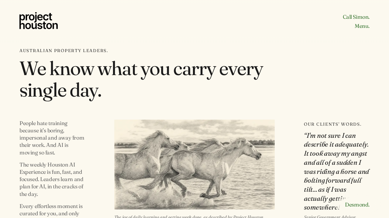
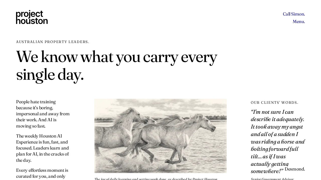
This run says nothing about forced colours, because the measurement never happened. The picture below is a real picture of the page with forced colours switched on in a screenshot session. No style was added. The background turned white, the text turned black, and the links turned blue. Those colours come from the forced colours setting, not from the website.
Option one: change the check
The same test setting as in group 1, bypassCSP: true in tests/playwright.config.ts, would let the test add its style. The website would not change. Axe would then check the page with forced colours at all 26 sizes.
Option two: change the website
The Worker could send a different security setting on a test computer only, as in group 1. Visitors to projecthouston.ai would keep the strict setting.
Every screen size in this group (26 rows)
| Screen size | Browser |
|---|---|
| Phone, Android 320, 320 by 568 pixels | Chrome (Chromium) |
| Phone, Galaxy Z Fold 7 cover screen, 360 by 764 pixels | Chrome (Chromium) |
| Phone, Galaxy S24, 360 by 780 pixels | Chrome (Chromium) |
| Phone, Android 384, 384 by 832 pixels | Chrome (Chromium) |
| Phone, Android 390, 390 by 844 pixels | Chrome (Chromium) |
| Phone, Pixel 7, 412 by 839 pixels | Chrome (Chromium) |
| Phone, Android 320 turned sideways, 568 by 320 pixels | Chrome (Chromium) |
| Tablet, Android tablet 768, 768 by 1024 pixels | Chrome (Chromium) |
| Phone, Galaxy S24 turned sideways, 780 by 360 pixels | Chrome (Chromium) |
| Phone, Galaxy Z Fold 7 cover screen turned sideways, 788 by 308 pixels | Chrome (Chromium) |
| Tablet, Nexus 10, 800 by 1280 pixels | Chrome (Chromium) |
| Phone, Android 384 turned sideways, 832 by 384 pixels | Chrome (Chromium) |
| Phone, Android 390 turned sideways, 844 by 390 pixels | Chrome (Chromium) |
| Phone, Pixel 7 turned sideways, 863 by 360 pixels | Chrome (Chromium) |
| Phone, Galaxy Z Fold 7, 984 by 1016 pixels | Chrome (Chromium) |
| Tablet, Android tablet 768 turned sideways, 1024 by 768 pixels | Chrome (Chromium) |
| Phone, Galaxy Z Fold 7 turned sideways, 1040 by 932 pixels | Chrome (Chromium) |
| Desktop or laptop screen, 1280 by 720 pixels | Chrome (Chromium) |
| Tablet, Nexus 10 turned sideways, 1280 by 800 pixels | Chrome (Chromium) |
| Desktop or laptop screen, 1366 by 768 pixels | Chrome (Chromium) |
| Desktop or laptop screen, 1440 by 900 pixels | Chrome (Chromium) |
| Desktop or laptop screen, 1536 by 864 pixels | Chrome (Chromium) |
| Desktop or laptop screen, 1920 by 1080 pixels | Chrome (Chromium) |
| Desktop or laptop screen, 2560 by 1440 pixels | Chrome (Chromium) |
| Desktop or laptop screen, 3440 by 1440 pixels | Chrome (Chromium) |
| Desktop or laptop screen, 3840 by 2160 pixels | Chrome (Chromium) |
Group 7. Firefox with JavaScript switched off stopped at the time limit: 4 checks
Chrome (Chromium): 0, Safari (WebKit): 0, Firefox: 4. Total: 4. These are the 4 Firefox checks of the same test as group 4.
What the check tests
The test is the one described in group 4. It switches JavaScript off and checks the headings, the main part and the menu links.
What failed
Each of the 4 checks stopped after 120 seconds, which is the time limit for one check. The saved record of each check shows that the page loaded and answered normally. The test then waits for the fonts to finish loading, by running a small script inside the page. In Firefox, with JavaScript off, that script never answered. I repeated that one step in my own screenshot session in Firefox, with JavaScript off, and it gave no answer after 20 seconds. The test never reached the headings.
What it means for a visitor
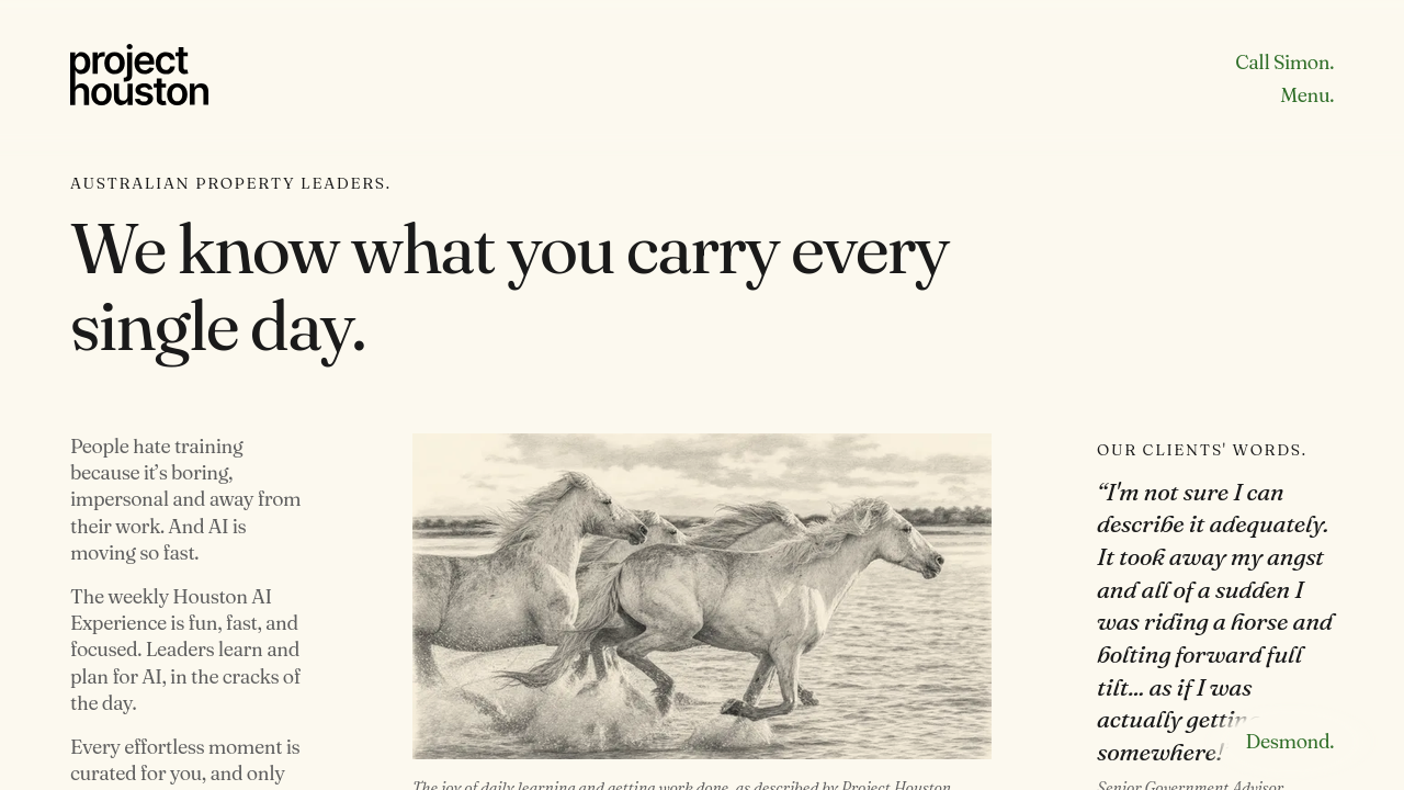
Nothing that this run can show. The picture below shows that the page opens in Firefox with JavaScript off and shows its words. I do not know the exact reason Firefox does not answer the script. To find out, someone would need to read how Playwright runs scripts in Firefox when JavaScript is off.
Option one: change the check
The test's shared helper, tests/support/site.ts, could skip the wait for fonts when JavaScript is off, or wait in a way that does not run a script inside the page. The 4 checks would then reach the headings, and would then fail in the same way as group 4 unless that group is also resolved.
Option two: change the website
I do not know of any change to the website that would make this step finish. The step waits on the test's own script, not on anything the website does.
Every screen size in this group (4 rows)
| Screen size | Browser |
|---|---|
| Desktop or laptop screen, 1280 by 720 pixels | Firefox |
| Desktop or laptop screen, 1366 by 768 pixels | Firefox |
| Desktop or laptop screen, 1536 by 864 pixels | Firefox |
| Desktop or laptop screen, 1920 by 1080 pixels | Firefox |
The style-file check: 404 problems
This check, called lint:css, reads every style file in the repository without opening a browser. A style file holds the sizes, colours and layout of the pages. The check found 404 problems. My earlier report of 17 November 2026 said 405. That was a counting mistake: I had counted the summary line as one problem. The correct number, from the check's own summary line "404 problems", is 404.
The 404 problems come from three kinds of file. 200 are in the two style files the website uses today. 59 are in the brand book's own style file. 145 are in old copies kept in the archive/ folder, which the website does not use. 200 + 59 + 145 = 404. The check reads the archive folder because it reads every style file in the repository.
A visitor does not see any of these problems directly. They are about how the style files are written. The rebuild pack's rules ask for a different way of writing them.
| File | Sides named with fixed directions | Typed values instead of named values | Text sizes in pixels | Screen-width rules in the older way of writing | Screen widths that are not on the allowed list | Total |
|---|---|---|---|---|---|---|
src/assets/css/site.cssThe website's own style file. It is used by every page. | 129 | 34 | 6 | 9 | 9 | 187 |
archive/261026_full_site/assets/css/site.cssAn old copy kept in the archive folder. The website does not use it. | 47 | 14 | 0 | 4 | 4 | 69 |
design/brand/brand-book.cssThe style file of the brand book page at /brand/. The build makes it. Nobody edits it by hand. | 8 | 38 | 11 | 1 | 1 | 59 |
archive/261026_full_site/assets/css/desmond.cssAn old copy kept in the archive folder. The website does not use it. | 21 | 7 | 1 | 3 | 3 | 35 |
archive/261026_full_site/assets/css/controls.cssAn old copy kept in the archive folder. The website does not use it. | 12 | 6 | 5 | 0 | 0 | 23 |
src/assets/css/decision-mirror.cssThe style file of the Decision Mirror page. | 10 | 1 | 0 | 1 | 1 | 13 |
archive/261026_full_site/assets/css/decision-mirror.cssAn old copy kept in the archive folder. The website does not use it. | 10 | 1 | 0 | 1 | 1 | 13 |
archive/261110_removed_from_eefd137/src/assets/css/toolkit.cssAn old copy kept in the archive folder. The website does not use it. | 5 | 0 | 0 | 0 | 0 | 5 |
| All files added together | 242 | 101 | 23 | 19 | 19 | 404 |
What each kind of problem means
Sides named with fixed directions: 242. The file names a side of a box with a fixed direction word, such as left, right, top or bottom, for example "margin-top" or "max-width". The check wants the newer words that follow the reading direction, such as "margin-block-start" or "max-inline-size". In a language read from left to right, both words draw the page the same way.
Typed values instead of named values: 101. The file types a size, a colour or a timing as a raw value, for example "#1A1A1A" or "24px". The check wants every such value to come from a named value in a tokens file, written like "var(--space-m)".
Text sizes in pixels: 23. The file sets a text size in pixels, for example "17.85px". The check does not allow pixels for text sizes. It wants "rem" units, which grow when a visitor sets a larger text size in their browser settings.
Screen-width rules in the older way of writing: 19. The file writes a screen-width rule in the older way, for example "(max-width: 900px)". The check wants the newer way of writing the same rule, for example "(width <= 900px)".
Screen widths that are not on the allowed list: 19. The file switches the layout at a screen width that is not on the pack's allowed list of 40, 48, 64, 80 and 96 rem (640, 768, 1024, 1280 and 1536 pixels). The widths found were 900 pixels (12 times), 1199 pixels (4 times) and 901 pixels (3 times).
The page-structure check: 173 errors
This check, called lint:html, reads the code of the home page that the website sends to the browser, and compares it with the rules of HTML, the language web pages are written in. It found 173 errors on the home page. Most of them are about how the code is written, and a visitor does not see them.
| Kind of error | What it means | Count |
|---|---|---|
| Spaces at the end of a line | A line of the page's code ends with spaces. A visitor does not see them. | 110 |
| An empty value written out | The code writes hidden="" where the check wants only the word hidden. Both mean the same to a browser. A visitor sees no difference. | 37 |
| Ordinary spaces inside a phone number | The phone number is still the stand-in "[04XX XXX XXX]". It has ordinary spaces. The check wants spaces that never break across two lines, so a phone number is never split over two lines. | 10 |
| An empty value written out | The code writes playsinline="" on the four films where the check wants only the word playsinline. Both mean the same to a browser. | 8 |
| More than one Heading 1 | The check allows one Heading 1 on a page. The home page has four. The second, third and fourth each count as one error. Your decision of 30 October 2026 set four Heading 1s on the home page, and the website's own check, named "Two Heading 1s", requires those four. | 3 |
| A name given to an element that cannot take one | Two blocks (the Rex and Sky narration strips) are given a name for screen readers with "aria-labelledby". The check says this kind of element cannot take a name. A screen reader is a program that reads the page aloud. | 2 |
| The first line in small letters | The first line of the page is written "<!doctype html>". The check wants capital letters, "<!DOCTYPE html>". Both mean the same to a browser. | 1 |
| A page title longer than 70 characters | The page title, which shows in the browser tab and in Google results, is "We turn leaders into the AI leaders of their business. | Project Houston". It is 72 characters long. The check allows 70. | 1 |
| A general block used where a "section" element exists | One block is marked with a role that says "this is a section". The check wants the plain HTML "section" element instead. A visitor sees no difference. | 1 |
| All kinds added together | 173 |
The Google search score: 69 out of 100
Google Lighthouse is a program from Google that scores a page in four areas. It ran 3 times on the phone setting. Each run gave the same scores. The pass mark for search is 90 out of 100.
| Area | Score out of 100 | Pass mark |
|---|---|---|
| Speed (performance) | 100 | 90 |
| Accessibility | 100 | 95 |
| Best practices | 100 | 95 |
| Search (SEO, which means search engine optimisation) | 69 | 90 |
The search score is made from 10 scored items. 9 passed. 1 failed: "Page is blocked from indexing". Lighthouse gives that item a weight of about 4.04, and each of the other 9 items a weight of 1, so the total weight is about 13.04. 9 divided by 13.04 is 0.69, which is 69 out of 100. One more item, "Structured data is valid", is not scored. Lighthouse leaves it for a person to check.
| Item | Result |
|---|---|
| Page is blocked from indexing | Failed |
| Document has a title | Passed |
| Document has a meta description | Passed |
| Page has a successful HTTP status code | Passed |
| Links have descriptive text | Passed |
| Links are crawlable | Passed |
| robots.txt is valid | Passed |
| Image elements have alt text | Passed |
| Document has a valid hreflang | Passed |
| Document has a valid canonical link | Passed |
Why it failed. When the Worker runs anywhere other than the live website, it sends a setting that tells search engines not to list the page: X-Robots-Tag: noindex, nofollow. This is written in worker/headers.js, line 35. The checks ran on the local copy, so the page told Lighthouse not to list it. On 17 November 2026 I checked the live projecthouston.ai, and it does not send this setting. So this failure comes from where the check ran, not from the live page.
The page also showed its main content in 0.7 seconds, against a limit of 2.5 seconds, and its layout moved by 0, against a limit of 0.1. These were measured on the test computer, not over a real phone network.
Report made on 17 November 2026 from the results of the run described at the top. The results files are on the test computer: tests/test-results/results.json, tests/playwright-report/index.html and tests/lighthouse-results/.